Boosting Conversions with a Streamlined Web Experienc
Revamped Tawkify’s site—clarified value prop, cut bounce rate by 18.9%.
About Tawkify
Tawkify is a North American matchmaking company helping over 1M singles find curated, human-vetted relationships—no dating apps required.
At-a-glance
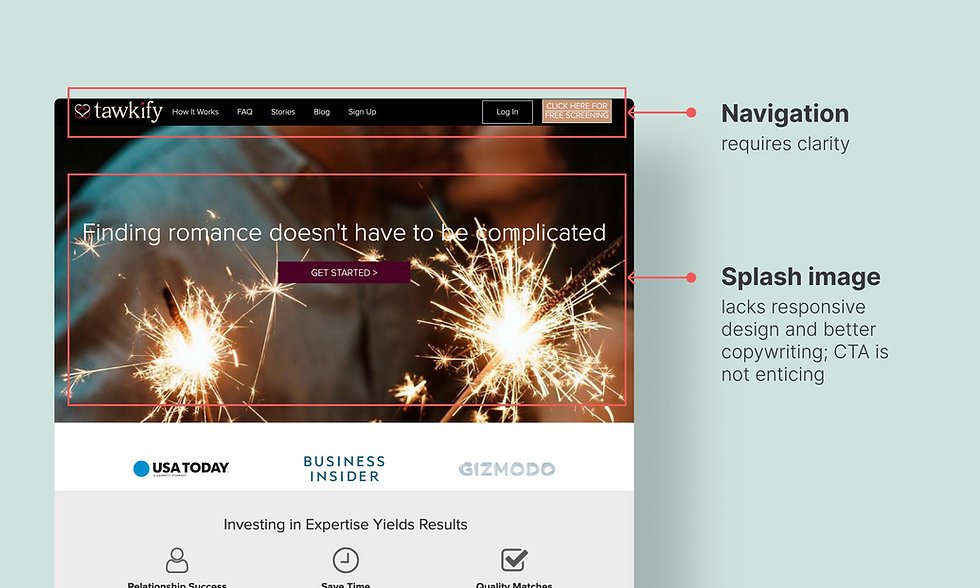
The homepage wasn’t doing enough to earn trust or encourage exploration. Visitors were leaving too soon—many didn’t understand how the service worked, and key storytelling touchpoints like blogs, testimonials, and press were scattered or underused. I proposed a centralized content hub, “Discover,” to streamline education, boost engagement, and give curious users more reasons to stay—and convert.
We needed to create space for slow, thoughtful discovery—without overwhelming users. By introducing lightweight content like success stories, videos, and media features in one responsive hub, we gave users a frictionless way to browse, learn, and build trust at their own pace—especially on mobile, where most drop-off occurred.
Role
Web Designer
Timeline
January 2023 → March 2023
Team
Adam Cohen Aslatei (Managing Director)
Lilia Havinson (Software QA Engineer)
Mikaël Castellani (VP Engineering)
Stack
Figma
Webflow
Jira
Adobe Photoshop
After Effects
Javascript
By the numbers
Research Insights
1. Usability & CRO Audit: Establishing a Direction
To reduce bounce rates and optimize conversions, I initiated a usability and CRO (Conversion Rate Optimization) audit. This process revealed that site functionality is not just a UX/UI challenge—it’s deeply tied to business strategy and revenue outcomes.
Key references:
-
Don’t Make Me Think by Steve Krug
-
Lean Analytics by Alistair Croll and Benjamin Yoskovitz
Both emphasized the interdependence between user experience, information architecture (IA), and business goals.
TL;DR
-
A Clear IA signals how much a company values its users.
-
Understanding user navigation patterns helps optimize their journey.
-
A logical site structure improves UX and boosts conversion rates.
2. Building a Research-Backed IA
To validate the above, I analyzed click data and drop-off points using heat maps, and organized data findings in Google Sheets to identify patterns across different page types and user journeys.
This combination of quantitative and qualitative research helped me:
-
Spot areas with high friction or poor visibility.
-
Identify which CTAs and navigation paths performed best.
-
Prioritize content restructuring based on actual user interactions.
From there, I developed detailed user personas and usage scenarios to map and refine the IA—turning behavioral insights into structure and flow decisions that better served our audience.
The user journey—from landing to becoming a paying client—involved several steps, but the website wasn’t guiding users clearly through that funnel.First, I conducted a full site audit: tracking URLs in a giant spreadsheet (yes, a bit of a monster), mapping the information architecture (IA), and identifying broken flows. Turns out, no one was monitoring live Webflow updates, and key pages like lead-gen forms were buried or duplicated.

.png)
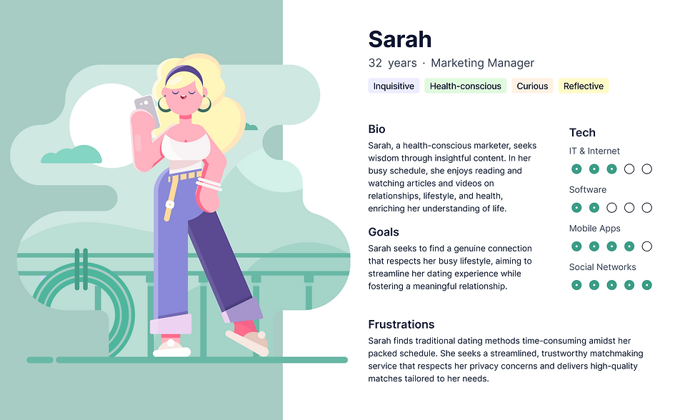
3. User Persona: Meet Sarah
While analyzing the customer database, I identified three key archetypes:
-
New users
-
Returning non-converted users
-
Paying clients
My primary focus was on Sarah, a new user discovering Tawkify via Google or ads. She represents an audience seeking a dating experience beyond static profiles—a community with engaging, interactive content.
Sarah’s persona guided my content and design decisions:
-
Engagement-Driven Design: Interactive, multimedia content to retain attention.
-
Journey Continuity: CTAs like “View More” to encourage deeper exploration.
-
Credible Content: Interviews with matchmakers and public figures to build trust.
4. Tech + Content Collaboration
To support the new content hub:
-
Collaborated with the engineering team to optimize site performance while hosting media-rich content.
-
Migrated from Vimeo/WordPress to Webflow’s in-built CMS for better speed.
-
Postponed migration of the WordPress blog to maintain focus on critical areas.
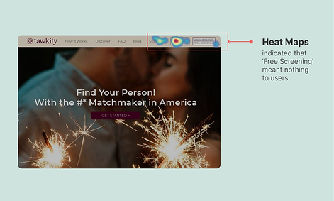
5. Focus Group Testing & CTA Optimization
During the redesign, we discovered that homepage CTAs were overwhelming, especially for new users.
Since user type (new vs. returning) wasn’t always trackable via analytics alone, I organized a focus group of singles aged 25–32 to conduct usability testing with a think-aloud protocol.
Key results:
-
Helped define clear user flows for new visitors.
-
Led to the removal of the “Free Screening” CTA, which was underperforming and confusing.
-
Enabled data-driven alignment with the rebranding team through weekly cross-functional syncs.
.png)
Developing the problem statement
This multi-pronged research approach—combining usability audits, IA theory, qualitative testing, and persona development—resulted in a more intuitive, performant, and business-aligned product. Our efforts turned assumptions into validated insights, streamlining the customer journey and strengthening Tawkify’s brand value.
I began questioning whether the issue stemmed from visual design, content relevance, or a deeper structural flaw in our information architecture (IA).
This led to a broader realization: the site’s functionality wasn’t just a UX/UI issue—it was a business problem affecting engagement, retention, and ultimately revenue. Drawing insights from Don’t Make Me Think and Lean Analytics, I understood that poor IA can erode trust and disrupt user flow, while strong IA reflects a brand's commitment to user needs.
The core problem became clear:
Users were not finding what they needed quickly or intuitively, leading to early exits and missed conversion opportunities.
This insight reframed our design goals—we needed to rethink the content structure, user journeys, and CTA hierarchy to better align with real user expectations and behaviours. So the problem statement ended up like this:
How might we structure content in a way that keeps users exploring and encourages them to take the next step?
Wireframing & Prototyping
.png)
To address content discoverability and boost engagement, I translated research insights into a low-fidelity wireframe for a centralized content hub. This hub would act as a bridge between user interests and Tawkify’s conversion goals.
Key UX goals for the prototype:
-
Visual Hierarchy & Layout: Prioritized clarity by grouping content into scrollable blocks (e.g., videos, interviews, blogs) with strong thumbnail images and headlines to reduce cognitive load.
-
Interaction Design: Integrated interaction patterns like “View More” buttons and subtle scroll cues to keep users engaged without overwhelming them.
-
Content Strategy in UI: Strategically placed CTAs throughout the page—not just at the end—to encourage natural user progression toward conversion.
-
Prototype Tools Used: Created in Figma, with components built for iterative testing and feedback with both internal stakeholders and a small user testing group.
I designed both desktop and responsive mobile layouts, ensuring that content flow and CTAs remained consistent across breakpoints. After initial feedback, I iterated on the prototype to streamline key interactions (such as filtering by content type or user goals) and added contextual nudges to help users navigate more confidently.
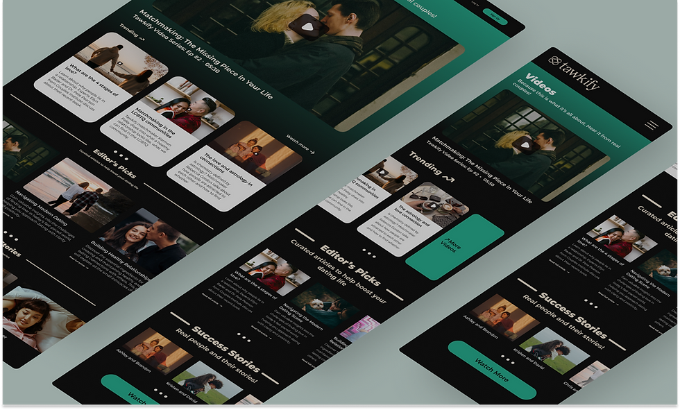
But 'Discover' didn't follow suit
The first version of the content hub ‘Discover’ has four distinct sections that cater to new users’ content needs but it doesn’t follow the IA that I charted out.
Ideally, the navigation bar should only have one ‘content’ hyperlink that directs users to a universal content page that includes every piece of content that a user might be searching for. However, after conducting usability tests, we found that many customers were getting confused with just ‘Discover’ in the navbar. Heatmap recordings suggested users were keen on learning about how the whole matchmaking process works and more often than not, the FAQ section was getting more hits because nobody knew what Tawkify was. That makes sense since my project targets new users. The findings from the usability tests indicate that users need clearer navigation options to understand the site's purpose and functionality better. More on this iteration later below.
.png)
How relying on user instinct directed my second iteration
While the rebranding team completed its project, I iterated on the IA and determined the best approach— displaying "Discover" as an additional resource on the navbar. With that resolved, I overhauled the original design to ensure it was mobile-friendly, addressing the growing importance of mobile accessibility and user experience in today's digital landscape. There were two major reasons for this overhaul:
-
Cognitive overload: The original design for Discover was entirely focused on desktop users. Why did I think all users who were browsing Tawkify resembled Meg Ryan from You’ve Got Mail (1998)? My user persona is partially to blame. Single-millennial makes good money-ready to mingle? I should have relied on actual data instead. But it wasn’t too late, so I jumped right back on track with actionable data from Google Analytics. I found that about 28% of users were browsing our website on mobile. That’s a sizeable amount of sessions potentially lost to bounce rate just because I did not make Discover mobile-friendly. The prototype I built has two columns of visual data on the header, with the right-side column scrollable. I was allowing users to pick from a sea of videos. And if there’s something I have learnt from this scrolling case study is that viewing time above the fold has reduced from 80% to just 57% in the present age, owing it to information density.
-
Accessibility principle and Hick’s law: Ensuring that the website was accessible to all users, regardless of their device, was crucial. By simplifying the design and reducing cognitive load, I wanted to improve the user experience and make the website more intuitive and navigable. I also keep reminding myself of the infamous Hick's Law, which states that the time it takes for a person to make a decision increases with the number and complexity of choices. This was another key consideration. By presenting information in a clear, organized manner and limiting the number of choices presented at once, the design aimed to make it easier for users to find and engage with the content they were interested in. This approach not only improved usability but also aligned with best practices for mobile design, where screen real estate is limited and simplicity is paramount.
.png)
How I went from a 39 to 90 on the Performance Diagnostics Test (PageSpeed)
Google’s PageSpeed Insights was a green signal for me to test the prototype further. I did something different this time around, I divided the group of participants into two groups. To one group, I sent out surveys and to the other, I had a 1-on-1 with directly. There was no specific reason why I did this, I just wanted to see how much of a deeper insight I could get from both groups. In my experience, I’ve observed how users manipulated results because they were being observed. It’s not a negative thing to fuss over, but the idea of sounding smart always takes reign in environments like these. I could not find any solid evidence of my confirmation bias so I saved the energy for another day.
Some common questions I asked during these interviews were:
-
At first glance, describe your understanding of the brand Tawkify. Where would you go next from the Home page?
-
What is your understanding of the page Discover? Do you see it as an independent menu item or a collection of related items?
-
How would you score your motivation to subscribe to Tawkify’s services?
-
How would you score your understanding of the content displayed on Discover?
-
How would you score your information-seeking journey on Tawkify?

.png)
Before & After
Iteration #1: Users scroll to the end of the page upon landing.
I found that in the journey driven by curiosity, seeking what is available entirely is the primary reason for scrolling to the footer of the website. Others may be seeking closure, wanting to confirm they've reached the end of the content. They may also anticipate finding important information or calls to action at the bottom of the page, such as contact details or next steps, prompting them to scroll down for further engagement. Taking all these assumptions into account, I introduced a horizontal scroll that would allow similar content to be stacked next to each other, therefore saving space for other formats.
.png)
Iteration 2. Playing a video in-line/pop-up instead of loading it on a new page reduces bounce rate.
In the original design, all videos on the Discover page would open in another browser. Thereby increasing chances of exiting the session within seconds. I worked with the engineering team to develop a code for playing all YouTube/Vimeo videos within the Discover page as a popup instead of confining it within the container. By doing so, the session is still running and provides the user with a better user experience on desktop.
.png)
Iteration 3. Adding a brief description for a video gives more insight into its content.
Many users have responded to my survey questions with this recurring suggestion of including a short explanation of all videos, like an excerpt, so they can quickly decide whether or not they should watch the video as the title alone was not enough. So I expanded the video container to type an excerpt for featuring videos.
.png)
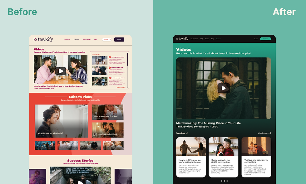
Iteration 4. Dark mode beats all.
Users stated that the Discover page had an overwhelming amount of content to browse through. To counter this illusion, I changed the background theme to a gradient and immediately saw a positive response. I chose a gradient after testing with solid colours, patterns and images. I also changed the hierarchy of content based on heatmaps.
.png)
Discontinued… even after getting conversions?
The final design reduced the bounce rate by 18.9% within 3 months of launching and performing iterations. Quoting one of the A/B testing participants Adam, “I love how I’m greeted with a large visual as I land on this page, it must be important? I like the dark theme, it’s relaxing to my eyes.” The most important lesson I learned while designing Discover for Tawkify is how people interact with different blocks of content depending on which device they are on so optimizing every website section became my priority. I also learned the importance of balancing information density with visual clarity to create an effective browsing experience.
Despite achieving successful results with the Discover project for Tawkify, including the reduction in bounce rate and positive user feedback, we ultimately decided to discontinue the project. This decision was made due to shifting company priorities and a strategic pivot towards new initiatives that aligned more closely with our long-term goals. Additionally, our insights from this project highlighted the need for a more holistic approach to content interaction across different devices, prompting us to redirect our resources toward a more comprehensive redesign that could better address these findings. This experience underscored the importance of achieving short-term success, aligning with broader strategic objectives, and continuous improvement in user experience.
Thanks for reading, you’ve reached the end of this page! Scroll to the top↑