
Reducing User Drop-Off Rate During App Onboarding
Streamlined onboarding at Riley AI—CSAT jumped
to 80%+ in under a month.
About Riley AI
Riley is a NYC-based startup pioneering natural
language processing (NLP) for automating professional relationships.
At-a-glance
Despite its technological prowess, the company faced a critical issue: low conversion rates on its app. The exhaustive step-by-step profile setup process annoyed users and prevented them from fully utilizing Riley’s true potential.
When I joined the team in 2022, the app was in its nascent stage with only a voice activation screen similar to Siri or Alexa; there was no home to navigate to. While it’s a bold choice for a startup to skip the usual IA and user flows, I have learnt from multiple user surveys that familiarity wins every day.
Role
Product Designer
Timeline
April 2023 → May 2023
Team
Andrew Reiner (Product Owner),
Eli Szus (Director of Frontend Engineering)
Stack
Figma
Adobe Photoshop
After Effects
Giphy
By the numbers
App audit reveals a missing value proposition
A heuristic audit helped me reveal areas of improvement and usability issues. Along with a user survey, I realized the critical flaw that was obstructing the exploration stage: information overload. The frustration began early in the user journey, during onboarding. My initial thought as a user—The home screen is a chat interface similar to Siri. Why? Also, the microphone activates the voice assistant. So, a single chat history for everything?
I collaborated with Riley’s developers and stakeholders to implement a simplified and guided onboarding process, focusing on the value proposition i.e. the power of tapping into Google and LinkedIn networks.
Developing the problem statement
Onboarding screens had too much information to parse through. And I learnt that most users did not truly understand what Riley was capable of, and neither of the above onscreen prompts helped either.
After gathering information from existing data points, I leaped to the dark corners of a library to find guiding principles that would help me develop a lean onboarding experience for Riley’s users. This book has several chapters outlining the EUREKA framework and ways to refine onboarding success milestones.
TL;DR
→ User onboarding is the sum of successful touchpoints i.e. onboarding doesn’t stop at the first touchpoint.
→ Touchpoints help people understand the product in the ‘context of their situation’.
→ People don’t spend much time trying to understand what a new product or experience is i.e. they are careful with time, or to put it harshly, they are lazy.
.png)
According to John, user onboarding is “the process that takes people from perceiving, experiencing, and adopting the product’s value to improve their life.” This resonated with Riley’s core values or, how do I say it without sounding like Patrick Bateman from American Psycho (2000): the modus operandi. Being a productivity app that eases the weightlifting attached to professional networking, our ultimate aim was to make our users’ lives easier. And how might we do that if we cannot articulate the same without confusing ourselves? So, taking inspiration from the book and Slack’s value vs. time graph, we penned three key milestones to track the success of an onboarding experience: when a person perceives Riley’s value, when they first experience that first ‘aha!’ moment, and when they integrate Riley into their lives. This is where we found our USP, all we needed to do now was find a way to visualize it on the app. Since most of our initial users were beta testers, they already had an idea of what they were getting into; we now had to look at fresh perspectives to test whether our new approach would work when scaling the product or not.
I listed out Riley’s biggest USPs to help the team stay on the same page (more on building the design system here):
-
Instant integration with your professional network: Users can access all their connections and leverage AI suggestions to build better relationships with minimal effort.
-
Personalization and data enrichment: From generating follow-up emails to providing contact summaries and sending automatic LinkedIn requests, Riley acts as your virtual assistant, streamlining your workflow and enabling you to focus on meaningful interactions.
-
Browse your data: Users can access all-time data from emails, LinkedIn connections, and other public sources, compiled and sorted.
The EUREKA framework is simple to understand once we’ve differentiated product-led from sales-led. Riley is a free-for-all app that had a subscription model planned for much later in the timeline, including a sales dashboard for lead generation in the pipework. Since Riley is product-led, I prioritized the time vs. value graph as much as I could. The graph essentially reflects the amount of time a new user takes to “realize value from a product” while also bearing in mind that a short sign-up process does not equal an excellent onboarding experience. The keyword here is ‘value’ so I was to solve the biggest issue Riley was facing overall.
Hence, the problem statement came down to this:
How might we design an onboarding flow that not only educates but motivates users to return and engage regularly?
Wireframing & Prototyping
I collaborated with the founder and the lead of front-end engineering to brainstorm what we now proudly call Dashboard, the foundation of our new user onboarding experience. I now have the three keywords in hand: AI suggestions, meaningful interactions and data.
Imagine landing on a blank screen after running an app— I’ve already lost my own attention. Moving on, I utilized two of the biggest takeaways from my preliminary research to sketch and draft a lo-fi wireframe:
-
A user has minimal time to get things in motion.
-
They lack the attention to fully grasp what Riley can do.
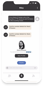
The first section is meant to replicate our daily reminders or list of things to do. For example, if Andrew has an upcoming meeting with an investor later today, the first ‘card’, in a series of swipeable cards, will show his meeting details along with key action buttons that can help him prep for the meeting. These action buttons eliminate Andrew’s need to open his Calendar and scrape any information he needs to prep. He can now get talking points/ice-breakers for the meeting and a summary of who the investor is outside a boardroom, and can also send a very personalized ‘looking forward to meeting you’ email right from the Dashboard.
I got the inspiration for this card-style UI from Apple and Slack. Apple has pioneered the field of UI ever since I can remember and I’m a big fan of how iOS has been constantly revolutionizing design languages all over the world. Naturally, I implemented my take on Riley’s Dashboard.
The second section is a generalized action center that we used to call the ‘Activity Center’. But consensus preferred ‘Explore Your Network’ since the verb at the front nudges the user a little more than just ‘Hey, let’s have you do an activity’. The three buttons do not change as the previous section did and serve to be the Kickstarter to building a professional network: email a connection to either catch up or set up a meeting, get information about a contact, or record a voice memo that will use speech-to-text to sort information under a specific contact. The whole point is the user doesn’t have to remember tiny details about a person, everything is already available on the dashboard, given they ‘enrich’ their contacts with data points like favourite sport, snack, trip, movie etc. Enriching can be done in two ways, either search for the contact and manually enter information or tap the mic to let Riley do the work. So the struggle within our team was to showcase this functionality within the first 15s of onboarding.
The third section is dedicated to network insights, similar to what LinkedIn Premium displays: the % professionals in different industries, their age groups, similar job titles etc. This section is meant to help users enhance their network by tapping into potential.
.png)
A Whole New Look Unleashed
I incorporated the EUREKA framework in the first user flow on the home screen, emphasizing another hack I learned during my research phase: test as you go. What this new build did was set the course for a series of frustrations that arose only during my usability test: the number of icons is now more than ever. At this point in the design process, I was only testing with the developers and designers.
I put a pin on it and moved on to the sign-up flow. Now that we had new problems to solve at the back of our minds, I moved on to ideating and sketching the first touchpoint as emphasized by John in his book. If I lose the user in the first few seconds of running the app, all my efforts would be in vain. The first touchpoint mattered to me the most.
...with a lot of friction points.
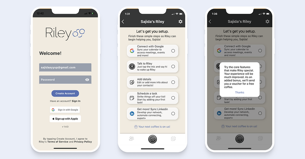
I got so carried away with the new Dashboard, I mean I was so proud of what I created, that I overdid the sign-up process. I forced every new user to make their profile at the very instant and did not provide a universal Skip button; instead, I had it on every screen. So I reached out to distinct product experts online to find a solution and this phrase kept resurfacing: avoid asking users to confirm their email address— it’s not urgent. And, the second lesson is from Userpilot’s State of SaaS: single-page sign-ups make everyone’s life easier. I could always nudge the user to fill in the information later during onboarding.
How my team and I improved the sign-up experience with usability testing
Reworking Riley’s whole experience meant we (developers and stakeholders) had to collaborate and pick each other’s brains collectively. During our weekly Monday morning sprints, we dedicated an hour to discussing three concerns/suggestions that could enhance the user experience. I then sketched out the user flow to help visualize the outcome of each flow, I figured it best to show the team on a Miro board where everyone can move things around on our ‘playground’. It was our founder Andrew’s idea to brainstorm together— it also helped everyone blow off steam. Welcome aboard, left-brain thinkers.
-
Single Sign-On(SSO) — We eliminated the intense sign-up flow and focused on getting the user to explore the new Dashboard as quickly as possible. The reason? Our user is not running a Rocky-like marathon on a weekday, during lunch. Ok, that’s another data point we discovered: most users preferred scrolling through productivity apps before lunch breaks i.e. between 10 AM and 2 PM. We could use this time to push notifications and emails as a reminder to use Riley. Aha!
-
Delayed Identity Confirmation — Our app is heavily tied to social accounts, especially LinkedIn, which means having the identity confirmation is critical to setting up an account. Our endless debate on whether or not to have this screen came to an end when we realized our ‘Sync Social Accounts’ screen doesn’t even show up until much further in the sign-up flow. Our decision to make it optional was not easy, we understand our users don’t like connecting social media to other apps for privacy reasons. Moreover, it was an optional step. So we got rid of the syncing step, allowed the user to pass through security and land on the Dashboard in <5s, and introduced a ‘Complete Profile Setup’ flow that they can always come back to later. We hypothesized that this step would give us better retention rates than before since we are giving the users all the power they deserve. And we were right, our user testing results showed an 80% satisfaction rate.

-
Important Questions Only — Our previous sign-up flow had two steps, the first one was all about the user and the second one was partially a product tour. After the user adds details about them, we ask them to add their first-ever contact in their Rolodex (what we call contacts). Our intention with this step was twofold: to get some data to personalize their Dashboard and show them how to create a contact. The rest of their Rolodex gets automatically filled out after they sync their LinkedIn/Google/both. Enriching of data begins and life becomes better with Riley. Tedious, right? Right. We removed everything in the sign-up process that was not immediately required for the account setup, including the first set of data like username, birthday, work history etc. All we need now is the user’s email address, like Asana. What I learnt from Asana’s onboarding is that simple things require a lot of time to design. It involves tons of user research and psychology that boils down to one human instinct outlined by Maslow’s Hierarchy principle: meet your user’s esteem needs for a successful onboarding by creating a sense of accomplishment, recognition, and respect.
-
Welcome Screen — Following Slack’s footsteps (we love Slack), we introduced a welcome screen right after a new user lands on the Dashboard to show our appreciation and respect. Our first few builds had a video tutorial with a voiceover showing how to use the app but it was not only slowing down the whole app but also not super helpful since it (we tested both a GIF and a video) had lost its quality in the production build. I leaned toward After Effects, Photoshop and Giphy but there was no solution in sight for about 3-5 days and I decided to move this demo video to the help section of the app and pointed towards much later in the user journey.
-
Product Tour — We always relied on an end-to-end tutorial of how to utilize Riley effectively, we focused on the big picture and forgot what our users actually needed. My user survey revealed that at least 46% of the respondents preferred an in-app walkthrough, be it a product tour or an interactive walkthrough. For our first push, I decided to go with a product tour to test how effective it was going to be. I used the After Effects components from the video tutorial that I’d earlier designed and refined it to look friendlier. I kicked out any aggressive and professional-sounding jargon and brought in a semi-formal motivation to explore Riley when a user has the time.


.png)
To achieve the above iteration, I scheduled one-on-one interviews with colleagues, mainly the engineers and stakeholders to get feedback on the newest build. I marked 1 for positive and 0 for negative emotions, and I also asked open-ended questions for qualitative feedback.
Some questions I asked during user interviews (on a scale of 1-10 where 1 is extremely frustrated and 10 is extremely happy):
-
How would you score your journey to complete today’s tasks? And would you like these ‘reminders’ on the Dashboard to be called ‘Tasks’?
-
How would you score your understanding of this new Dashboard?
-
How would you score your motivation to send a follow-up email after a meeting?
-
How would you score your trust with an AI-generated template for your emails?
-
How would you score your trust with AI to automate reminders based on the calendar you’ve synced with Riley?
Before & After
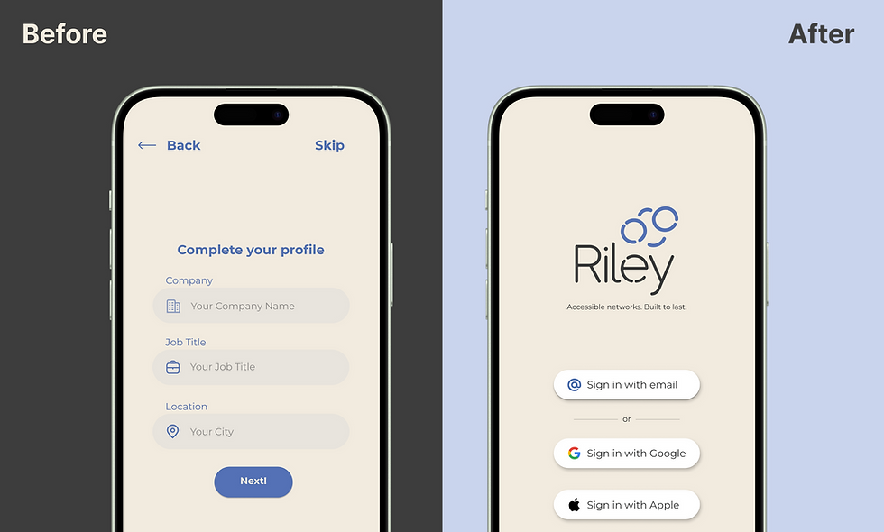
Iteration #1: No one wants to complete setting up a profile after downloading the app.
Users stated they were more interested in what Riley could do without manually feeding it information. Automation is the biggest keyword for ROI; they would not spend time creating a profile for a ‘non-social’ app. To improve the design, I removed the profile-setup process entirely as it can be populated later and is not of immediate concern.
Iteration 2. Seeing the purpose of ‘Sign up with Google/LinkedIn’ creates an incentive.
In the original design, users were asked to sync their LinkedIn accounts during sign-up. It did not explain why or how this step was crucial for Riley to automate their networking journey. Hence, I introduced an incentive modal that showcases four important features of the app that will elevate their current process.

Iteration 3. In-app walkthrough for the win.
I made on major modification based on the feedback from the usability testing sessions: the walkthrough wasn’t getting as many hits as I’d presumed it would so I turned to what I noted earlier in my research phase i.e. make the walkthrough a little less condescending. A slight nod to our friend, Maslow here. I added a progress bar with a ‘Skip Tour’ option for the new user and ensured brand colours were judiciously used. I also noted that keeping the subtext under two lines makes it less overwhelming, especially during an onboarding phase.

Walk-in on a dream
By this time, I was listening to Empire of the Sun's Walking On A Dream, the research and UI were coming together. Many users had indicated that they would love to see how different parts of the app function as soon as they entered the app. I designed an in-app walkthrough highlighting Riley’s top features along with illustrations to keep the onboarding process engaging.
My Vision for Riley AI
Riley AI is constantly evolving, and as we’ve learnt during our product sprints, we will never stop finding areas of improvement. But here is a quick summary of where I see innovations in:
→An interactive walkthrough similar to Slack’s onboarding process — I visualize a walkthrough that will train our users to use the most effective tools on the app instead of just telling them what to do. For example, taking the user along a journey of sending a ‘Nice to connect with you’ email to our founder Andrew who is automatically on every user’s Rolodex as their first contact. It’s a test email so our users don’t need to panic that they’re actually sending out an email.
→A tooltip that takes you to a help section within the app that houses the in-depth tutorial video, an instant way to reach out to Riley’s customer care team, and of course FAQs. I’m currently using this video as a sales pitch for investors, along with Andrew’s pitch deck that shows all the important bizz stats.
→Delay the email verification step with an added layer of security. This step means that we will not be able to display effective action cards/suggestions our AI generates daily. Connecting the user’s email to this account allows us to nudge the user towards Calendar syncing which is our biggest USP.
The team is currently working on a side project called RAIL, Riley’s AI Lead generation dashboard for sales folks. It’s in progress but here’s a little sneak peek into our Product Hunt designs that I worked on:

Thanks for reading, you’ve reached the end of this page! Scroll to the top↑