Revolutionizing Event Discovery for Gen Z
Helping Gen Z discover local events — fast, fun,
and together.
About Tixtor
Tixtor is a mobile-first concept designed for spontaneous social planning. Built for Gen Z, it replaces the stress of “what’s the plan?” with a swipeable event feed, quick RSVP flows, and built-in group planning tools.
At-a-glance
Gen Z users feel overwhelmed and frustrated when trying to find local events. Discovery is fragmented across social media, Google searches, and clunky ticketing platforms — often leading to decision fatigue or giving up entirely.
Create a fast, intuitive, social-first way to discover and plan local events with friends — all in one app.
Tixtor simplifies event discovery with a personalized swipeable feed, mood-based filters, and real-time group planning features. Within two design iterations, testers completed the RSVP flow 35% faster with significantly reduced drop-off.
Role
Lead Product Designer
Timeline
November 2022 → February 2023
Team
Jason Yeh (Designer)
Daniel Cappellacci (Designer)
Stack
Figma
FigJam
Maze
Notion
Trello
By the numbers
Research Insights
TL;DR
I took a UX Design course at Brainstation, Toronto from 2022-2023. I designed a mobile app as my capstone project to streamline the process of ticketing in Toronto. In four months, I delivered a working prototype that taught me the nuances of problem solving in UX.
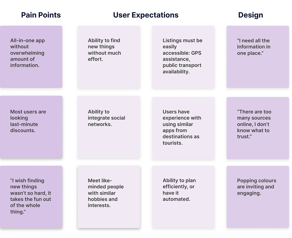
There are too many places to look for a fun event in Toronto: Instagram, Facebook, LinkedIn, Twitter, BlogTO, Eventbrite, Livenation, Redflagdeals, Google, etc. Researching and planning an event is dreary and taxing.
How might we make the event-seeking journey for people in Toronto both fun and engaging?


I collaborated with two fellow students to conduct research and design a new app for the residents of Toronto.
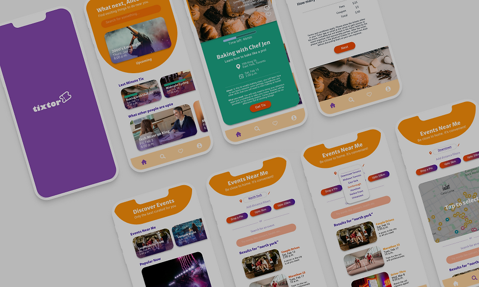
Key features:
-
Location-based searching
-
Last-minute tickets
-
Saving and sharing events with others
This app simplifies the event-discovery journey itself.
Applied Research: User Flows & IA
After understanding the competitors’ user flow and studying survey results, I designed a new app to be the ‘one-stop-shop’ for all events in Toronto. I interviewed 5 participants while my teammates interviewed 6, and incorporated the feedback to bring more clarity to the design. Subsequently, I created a high-fidelity prototype.
Following an in-depth survey of potential users, I created a persona perfectly suited to Tixtor's objectives. Consider Emily, for example, who vividly expresses her frustration with the time-consuming process of accessing multiple websites to discover and plan events. Her hectic schedule leaves little room for travel planning.
.png)
Information Architecture
I developed an information architecture to ensure Tixtor’s content is organized intuitively, aiding user navigation and scalability.

User Flows
I focused on 3 user flows to streamline Tixtor's design process, optimizing user journeys for enhanced engagement and conversion.
a) Last-minute tickets
This user flow charts a user's journey from start to finish of a single process, beginning on the home page and ending on the confirmation page. The purpose of this flow is to ensure the user keeps the flow by giving all the information related to the event, along with the price, without increasing the number of clicks.

b) Location-based Search
This flow ensures personalization along with accuracy.
.png)
c) Purchasing a Saved Event
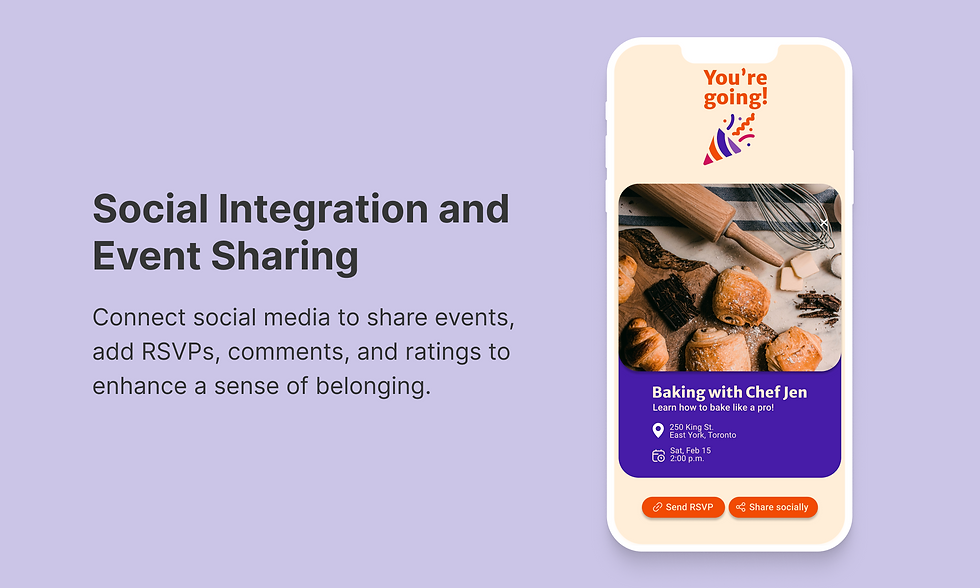
This incentive-driven page reminds the user of pending transactions, inspired by Instagram’s Saved page that drives action (content creation, event attendance, cooking etc.) with easy access. Integrating a saved events feature into Tixtor allows users to bookmark events they're interested in for later reference. Users can easily access their saved events from a dedicated section in the app, with options to organize them into folders or categories. Quick access shortcuts and cross-device syncing enhance usability, providing users with a convenient way to track and manage their event interests.

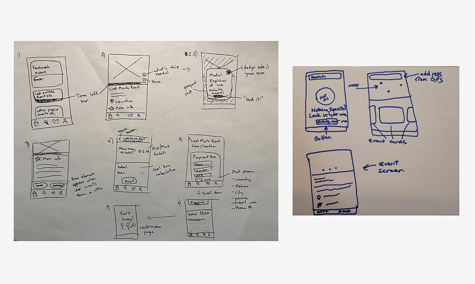
Sketches
The process below begins with our joint initial ideas for wireframes, then moves to mockups, and finally to high-fidelity prototypes. In this simple version, you can see how my approach solves the user needs after three iterations.
.png)
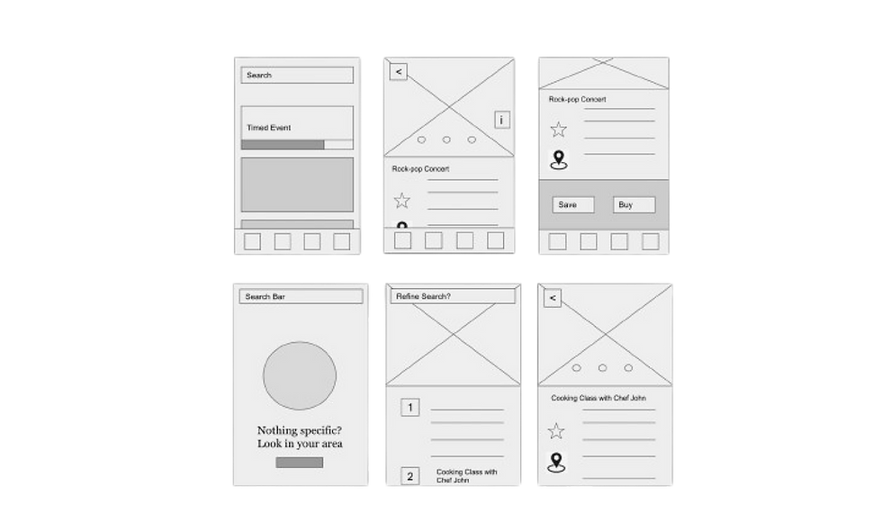
Wireframing & Prototyping
I then brought my idea to an interactive digital low-fidelity prototype and brought it to 6 potential users to collect feedback.
.png)
Usability Study
As a team, we conducted our user testing sessions on 20+ participants. I then took the responses through a card-sorting exercise to find common themes among the participants.
Sample questions:
-
What sort of other methods do you use to find events? How is each one useful to you?
-
When do you usually look for things to do in the city?
-
How do you find events when travelling?
-
If you could create a magical events app, what sort of features would it have?
.png)
Before & After
I made three major modifications based on the feedback from the usability testing sessions. I took note of the user comments and suggestions and worked towards implementing them in a way that would provide the best user experience. My goal was to integrate features that were highlighted during the usability study. To achieve this, I implemented common themes that arose from the card-sorting exercise and conducted another user testing session among different participants to see an improvement.
Iteration 1. Reduce the number of clicks.
Users emphasized the amount of time they spent on purchasing an event ticket in Toronto. Most of them are so busy, they mostly look for last-minute tickets, reducing the research time. So I made the content easy to skim through and reduced the number of screens it takes to reach the payment information page i.e. conversion.
.png)
Iteration 2. RSVP feature for inviting friends.
It was interesting to note that users who were ‘planners’ in their friend groups wanted an easy way to track attendees. Generally, they share the event link from the app to their chats and manually ask who among their friends would be able to attend. Hence, I added a feature that would allow a user’s friend to RSVP on the app without signing up.
.png)
Iteration 3. Interactive map of Toronto.
In the original design, users could search for events by typing in the name of the neighbourhood. To make it more engaging, I added an interactive map for users to zoom in/out and define the perimeter of an area that suits them best.
.png)
Product Successes
The final design incorporated all the pain points of our user persona. Quoting one of the early user testing participants Noah, “This app makes me want to explore Toronto even though I’m a resident. I usually send out event invites to all my friends so I think this will make things better for me to plan.”
What I Learned
-
What we envision and what the user needs/wants were completely different until conducting user interviews.
-
User Flow diagrams are super helpful in identifying all the different paths in a user’s journey.
-
User testing helps to reveal a lot of things that we as creators often overlook after staring at the prototype for hours.
-
Working in a design system with complementary colours and font family makes the app experience appealing and a joy to use. Accessibility (colour contrast) is integral in the design of the app.
-
Evolving the app: creating a series of events apps for major cities and perhaps, integration with flight booking services such as Expedia or TripAdvisor!
.png)
Click to play with prototype↓
Thanks for reading, you’ve reached the end of this page! Scroll to the top↑