
Unifying the Brand: Scaling Consistency with a Design System
Cutting redundant design requests by 60% and speeding up handoff by 40%.
About Riley
Riley is a NYC-based startup pioneering natural
language processing (NLP) for automating professional relationships.
At-a-glance
When I joined Riley AI in 2022, the technology was promising—cutting-edge NLP designed to automate professional relationships—but the experience wasn’t matching the innovation. Users were confused, engagement was low, and visually, the brand felt disjointed across platforms. It was clear: we had a product that worked, but a story that didn’t land.
Despite Riley’s tech strength, fragmented UI and inconsistent design patterns were creating friction. New users struggled to understand the product’s value. Internally, the dev team was juggling mismatched components, which slowed implementation and introduced inconsistencies.
We weren’t just losing users—we were losing trust.
I proposed a unified design system to ground Riley’s digital presence with clarity and consistency. The goal was to streamline design and dev collaboration, but more importantly, create a coherent, intuitive user journey that highlighted what Riley did best.
Role
Product Designer
Timeline
October 2022 → November 2022
Team
Andrew Reiner (Product Owner),
Eli Szus (Director of Frontend Engineering)
Stack
Figma
Notion
Jira
Loom
Miro
By the numbers
Research Insights
1. Audit Results
The gaps were obvious once we mapped them out:
-
The website’s header drew the most attention thanks to the demo video, but didn’t follow through with supporting information.
-
The “How It Works” section lacked clarity—users still left without grasping what Riley actually did.
-
The blog, home to our strongest content, was buried, making it hard for curious visitors to dig deeper.
We needed more than just visual polish—we needed a system that made storytelling effortless and product benefits obvious.
2. Embarking on the journey
The journey began with extensive research and discovery. I conducted interviews with key stakeholders to understand their needs and expectations. This included speaking with Riley's founders, developers, and even some of our users. Through these conversations, I identified the core issues and opportunities for improvement:
-
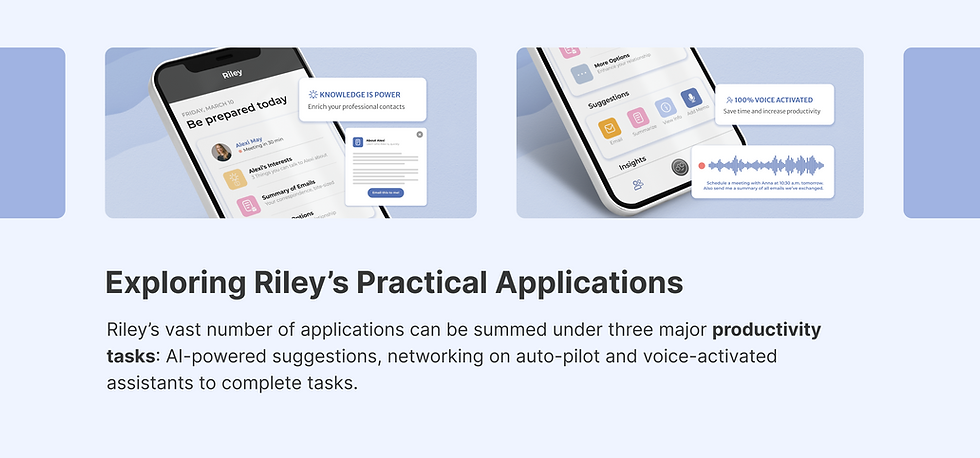
Lack of product understanding: The team had varying concepts of how the app should work. What started as a voice-activated platform to enrich professional networks has now evolved into a full-blown app with a homepage dedicated to 30+ tasks. All this information was making our users overwhelmed and at un-ease.
-
Disorganization: Design files and brand guides created by agencies earlier were hard to locate, and only searched for when developing a new feature. It was becoming increasingly harder to keep track of all the resources throughout the company, and not just the design team.
-
Misuse of tools: Google Drive was the sole storage space that also served as the documentation site. Internal users were using multiple copies of the design files to leave comments and ‘collaborate’ on projects. Priority projects were tracked on Jira but it was impossible to close tickets raised on Google, Slack and Adobe Illustrator.
-
Too many cooks spoil the soup: Different developers were implementing variables of buttons and colours, often resulting in pills vs square debate while testing after every push.
3. Laying the foundation
With a clear understanding of the challenges, I set out to define the foundation of our design system. The first step was establishing core design principles that aligned with Riley AI’s brand values and user needs. We decided on principles such as simplicity, consistency, and accessibility.
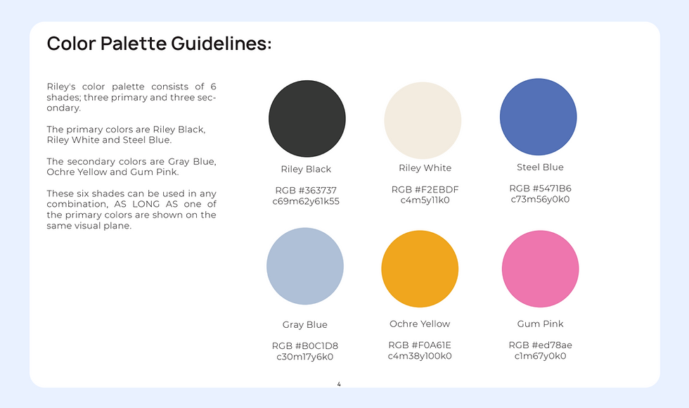
Next, I defined the visual language. This included selecting a colour palette that reflected our brand, choosing typography that ensured readability, and creating a set of icons that were both functional and visually appealing. Spacing guidelines were also established to maintain consistency across different layouts.
Since our core user persona was missing, I also took this opportunity to design one for the team.
.png)
Building the component library
Adopting an atomic design approach, I began creating a comprehensive library of UI components. Starting with basic elements like buttons and inputs, I moved on to more complex patterns and layouts. Each component was designed with scalability and adaptability in mind. Importantly, I ensured all components adhered to accessibility standards, making our products more inclusive.
To gather feedback, I created interactive prototypes and shared them with potential users. This step was crucial. Users provided insights that helped refine the components, ensuring they were not only functional but also intuitive and engaging.
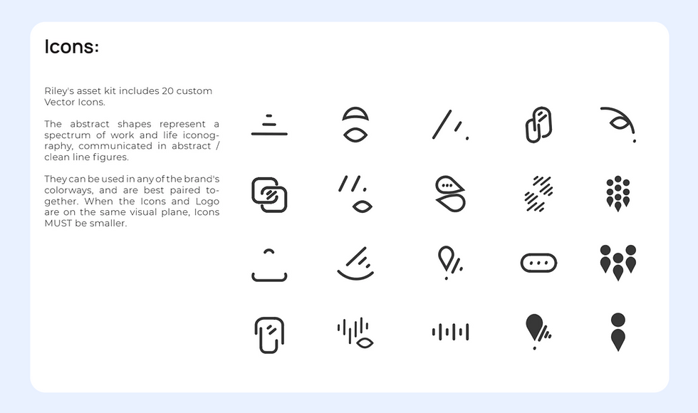
One of the biggest challenges I faced was trying to incorporate the existing icon library. None of these icons made any sense; they were not intuitive or accessible. Using them on any platform had only led to more confusion.
I didn't have to develop a problem statement for this project, but I was using the ultimate goal to solve our users' problems. So it made sense to have a floating question to reward the team and me.
How might we create a unified design language that improves user engagement and simplifies development across Riley AI’s platforms?
Moreover, the color palette guideline lacked crucial information for developers. There was no guideline as to how to use secondary or tertiary colors in buttons while hovering, and other states that are necessary for defining in the backend before pushing for production.
.png)
So I scrapped the library and designed icons that other apps were using, mainly the App Store, Jira, and Google. This reinforced the idea that users are humans and they are always looking for comfort, not disruption.
The enhanced design system was helpful for developers as it not only reduced time to implement changes uniformly but also removed speculation/assumptions when designers were unavailable for testing.

.png)
From Usability Testing to System Overhaul
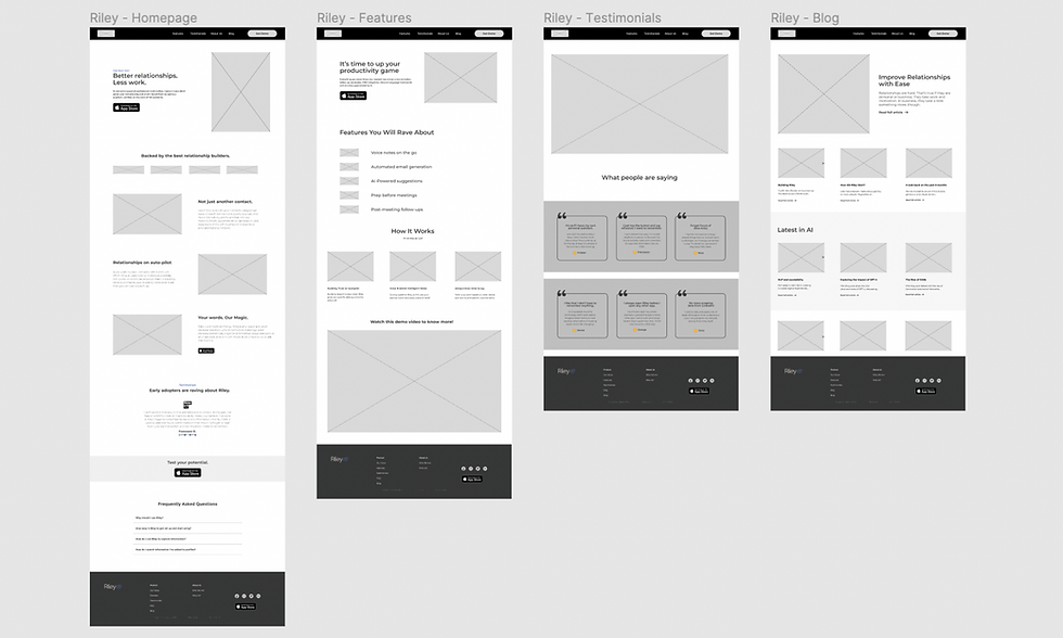
My primary website and app audit led me to construct a user journey of my persona Alex. He started by Googling Riley AI on his phone and saw that our app was available to download. After checking out the App Store, he decided to browse Riley’s website to learn more; whether he needed the app or not. By studying his path, I could understand the gaps within the brand that were not covered before.

The process below begins with my initial ideas for wireframes, then moves to mockups, and finally to high-fidelity prototypes. In this simple version, you can see how my approach solves the user needs after three iterations.
.png)
I then brought my idea to an interactive digital low-fidelity prototype to 10 potential users to collect feedback.
.png)
.png)
.png)
Usability Study
As a team, we conducted our user testing sessions on 10+ participants. I then took the responses through a card-sorting exercise to find common themes among the participants.
.png)
Integrating Feedback
User feedback after the new design system was implemented led to several key iterations that improved the user experience overall:
-
Simplifying Onboarding: Users found the initial profile setup cumbersome. I redesigned this process, allowing users to skip setup and explore the app’s features immediately. This change significantly improved the first-time user experience.
-
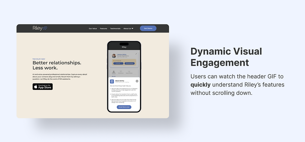
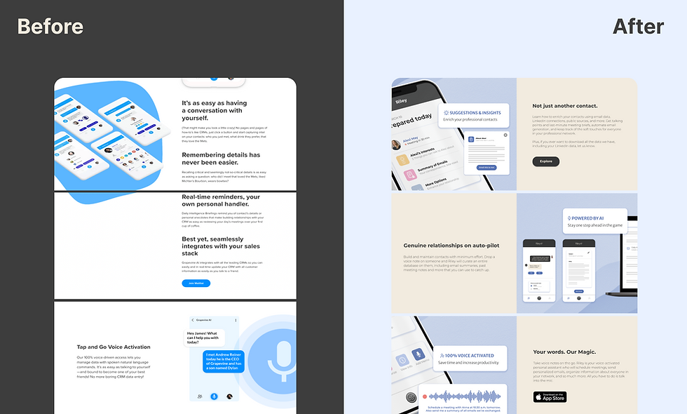
Incorporating Motion Graphics: Static screenshots were replaced with GIFs that quickly demonstrated Riley’s core functionalities. This made the website more dynamic and engaging.
-
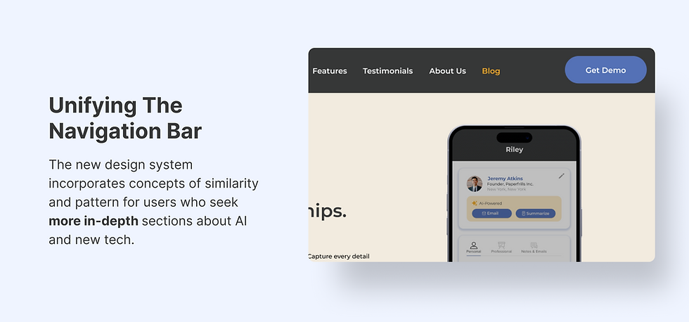
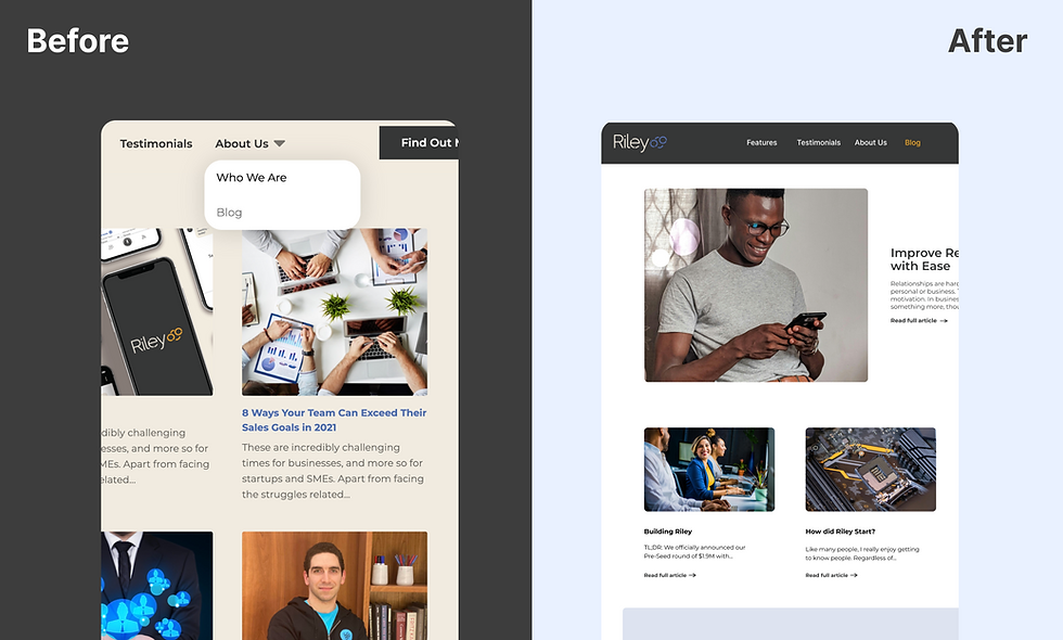
Enhancing Content Accessibility: The blog, previously buried under the About Us section, was moved to the main navigation bar. This change made valuable content more accessible and significantly increased user sessions.
Before & After
The new design system brought about a remarkable transformation. The streamlined design and development process increased efficiency, reducing the time required to create and implement new features. The consistent and cohesive user experience led to a 34% increase in page sessions and a 7% reduction in bounce rate within the first month of launching the redesigned website.
Documentation and Collaboration Tools
With the components in place, I focused on creating detailed documentation for each one. This included usage guidelines, best practices, and code snippets. To facilitate collaboration, I implemented tools like Figma and Miro. These tools allowed for real-time collaboration between designers and developers, ensuring seamless integration of the design system into our development workflow.
Elements of the new design system:

.png)
Iteration 1. Initial component development
-
Before: Inconsistent use of design elements led to fragmented user experiences.
-
After: Developed a standardized set of UI components, ensuring consistency across all products and platforms.
.png)
Iteration 2. User testing and feedback
-
Before: Limited user testing on design components resulted in usability issues.
-
After: Conducted extensive user testing sessions, gathered feedback, and iterated on components to enhance usability and user satisfaction.
.png)
Iteration 3. Integration and adoption
-
Before: Development teams faced challenges integrating design changes, leading to delays and inconsistencies.
-
After: Provided comprehensive documentation and training sessions, facilitating smooth adoption and integration of the design system by development teams.
.png)
The final design system for Riley AI featured a cohesive set of UI components, clear design guidelines, and robust documentation, all designed to ensure a consistent and efficient design process. The system was built to be scalable, adaptable, and easy to use, promoting collaboration and innovation across the organization.
Results and Successes
The implementation of the design system resulted in significant improvements:Increased Efficiency: Streamlined the design and development process, reducing the time required to create and implement new features.Enhanced Consistency: Ensured a unified user experience across all products, leading to higher user satisfaction and engagement.Improved Collaboration: Fostered better collaboration between designers and developers, enhancing overall productivity and innovation.
What I Learned
This project highlighted the importance of a well-defined design system in creating a consistent and efficient design process. By prioritizing user feedback, accessibility, and collaboration, we were able to build a design system that not only met the needs of Riley AI but also set a foundation for future growth and innovation. The success of this project demonstrated the critical role of a design system in delivering a cohesive and engaging user experience.
.png)
Thanks for reading, you’ve reached the end of this page! Scroll to the top↑